Personal Investigation part One: The Photobook
For this unit, we have been tasked with creating our own photobooks. The reasoning behind this is that for years, photographers work has been mainly shown through photobooks (there are more photobooks than there have been exhibitions). Another reason for this is to get the skill of choosing a select amount of images from a huge archive to place in the book. Taking, choosing and publishing our images in a way which we decide ourseleves from studying other books will give us practice on how to showcase our own images in our own preffered way, and how to give our images more meaning than we inteded when we took them.
Diptychs
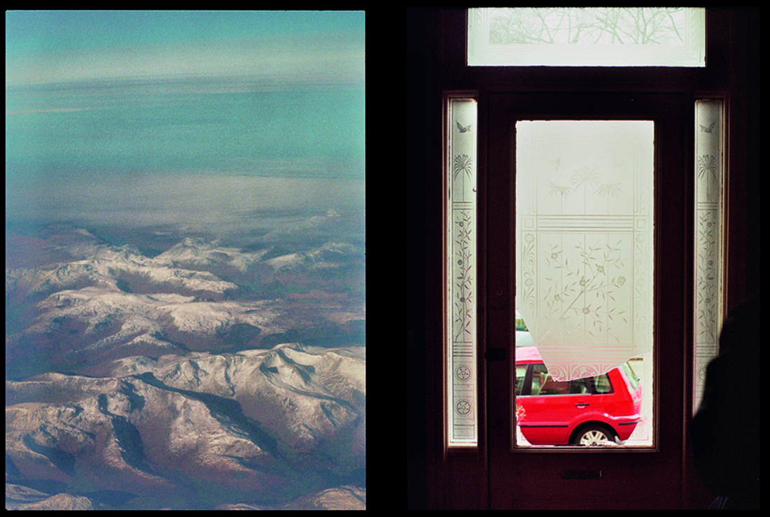
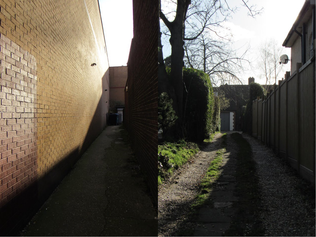
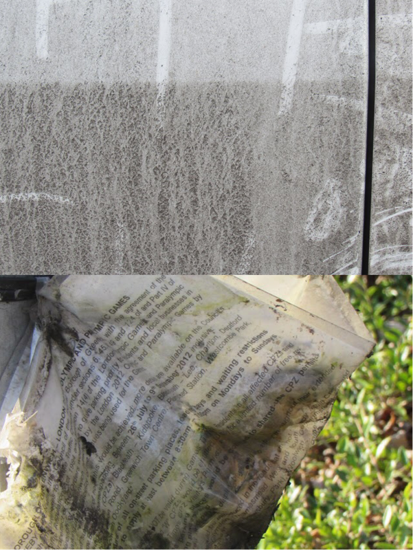
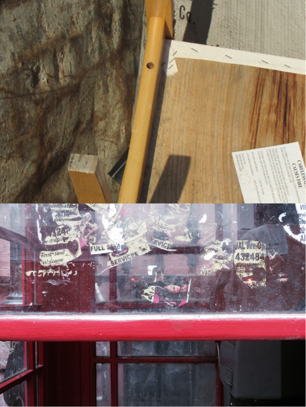
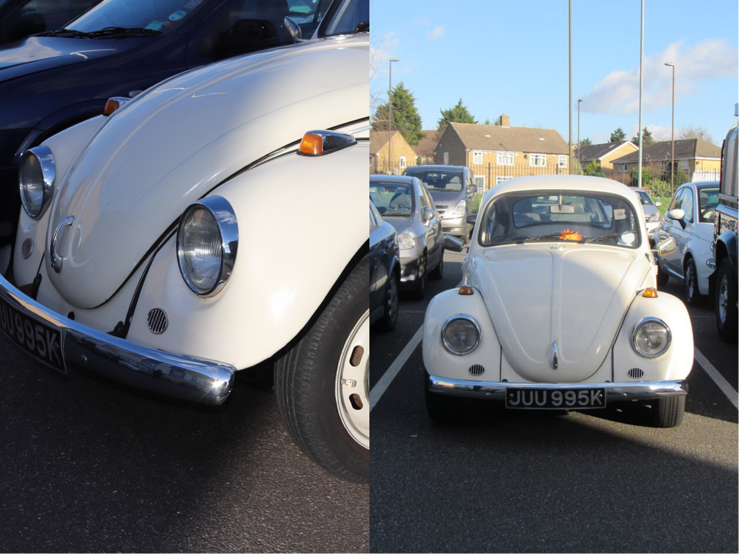
We made diptychs to see what two images together look like. We experimented with putting two images that are similar, two images that contrast and two random images together. I personally like the idea behind putting two random images together because even though there isn't a clear one, your mind starts to look for links between these two images and often finds some that were not there by intent.
TRIPTYCHS
The Photobook
I looked at a few different examples of different photobooks to get some inspiration for my own one. I tried to look at photobooks that were distinctively different from eachother in terms of photography and the general style of the book, to get a wider range of different examples to choose from.
Suite Venitienne - Sophie Calle
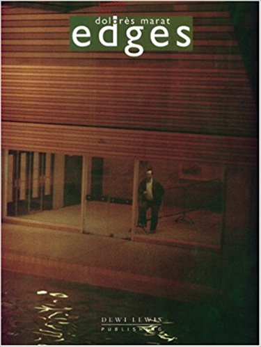
Edges - Dolorés Marat
I looked at the book Edges by Dolorés Marat. This is Dolorés Marats' third book and the photos are a series taken over ten years in Paris. The book features images taken indoors and out, of the many things in and around Paris. I'm assuming all of the images taken were developed with the same obscure process because they all have the same look and feel. It is clear that she did not use flash for these images, as there is a prominent motion blur on lots of the images and lots of them have quite a dark, dingy look about them. I think this adds to the overall look and theme of the book, making each image relate in this particular way. Most of the pictures have the same colour composition, with lots of greys, greens, yellows and reds. The pictures are arranged in an order where the images with a similar colour composition are arranged next to each other. The fact that it is arranged like this gave me the feeling that all the images for that section of the photo book were taken around the same time, but the typography on the side shows the different locations and dates, even if they are years apart from one another. I personally like the way this has been set out, as I was quite shocked but impressed that all these similar looking photos were taken years apart and miles apart. I learned that Dolorés Marat develops her photographs in quite an obscure/unique way to make her images come out looking like watercolours. I can see this as the colours in lots of the pictures in this book are blurred, taking away the finer details of things and making it look like a watercolour painting. I found this interesting as I could tell that they're all photographs without a doubt but there was something about them that made them seem different to 'normal' looking photographs, and the development process made it like that.
In terms of the overall look and feel of the book, I liked it. The type of paper used is quite different in texture to the paper used in other photo books I've seen, it has more of a canvas type feel which could be staying true to the paint looking effect Marat gives her photographs, giving them more of a hands-on art feel. I also like the typography on each side of the paper, saying the date and location of the image. It's simple but gives enough information, more than what other photo books have.
In terms of the overall look and feel of the book, I liked it. The type of paper used is quite different in texture to the paper used in other photo books I've seen, it has more of a canvas type feel which could be staying true to the paint looking effect Marat gives her photographs, giving them more of a hands-on art feel. I also like the typography on each side of the paper, saying the date and location of the image. It's simple but gives enough information, more than what other photo books have.
American Surfaces - Stephen Shore
|
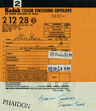
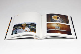
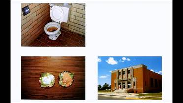
The next photo book I looked at was 'American Surfaces' by American photographer Stephen Shore. I know that the images in this book are renowned for changing the face and moving documentary photography to a new level. It is a series of photographs taken between 1972-73 and documents Shores time travelling around the United States. There is a clear theme and similarity between the pictures throughout the book, really documenting his travels. I personally like how it plays around with the order of the photos. Even though it is documentary it dos not seem to be completely in order, but at the same time it could be. The numerous toilets and plates of food paired with different people, places and objects really shows how shore left nothing out of this photographic journey, showing more than the average documentary photographer would. In terms of the book itself, I like the way it has been presented. I would have thought the cover would have had more relation to the content of the book, maybe a blown up image of a building, television or meal. Instead it is a blown up image of the envelope film comes in that shore would have used to collect the photos taken for this series (they all have to be film as digital photography didn't exist in the 70's)
|
Corrupted - RAYSCORRUPTEDMIND

|
Corrupted is an example of a more simplistic photobook. It has a basic layout, one photo covering the whole page. This is the layout for the whole book, with no captions or anything extra. Even the cover is extremely basic, a plain background with just an image of the corrosion symbol with the title under it. CORRUPTEDRAY is a new age photographer who's main platform for showcasing his work is social media. Most of the images compiled in this book have already been shared on Instagram so there really is no need for him to add captions to his book as he does not usually do this when he posts images.
In terms of inspiration for my photobook, there are parts of this plain layout that I like and don't like. I like how the images cover the whole page with no other ones overlaid, it gives each image an equal significance and status within the book and lets them all standout on their own. I will not use this type of layout throughout the whole of my photobook, but in parts of it I will for certain images and pages, if I want a particular set of images to stand out on their own like this. |
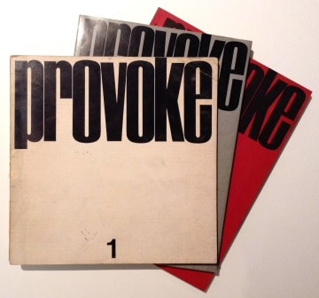
Provoke
|
In 1968, photographers Daido Moriyama, Yutaka Takanashi and Takuma Nakahira released the experimental photgraphy magazine 'Provoke' with the help of critic Koji Taki and writer Takahiko Okada. The objective of the 3 editions released was to challenge the general conventions of Japanese Post War photography. The subtitle of Provoke is 'provocative documents for thought' and the photographs inside argue that the photographer can capture what cannot be expressed with words.
|
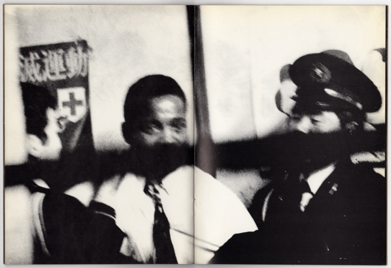
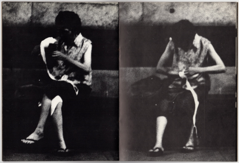
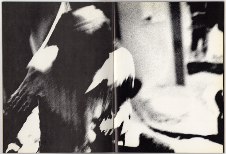
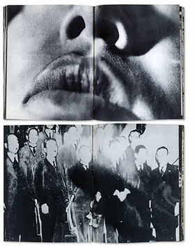
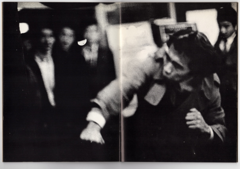
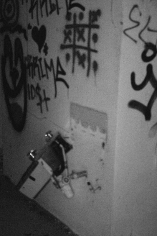
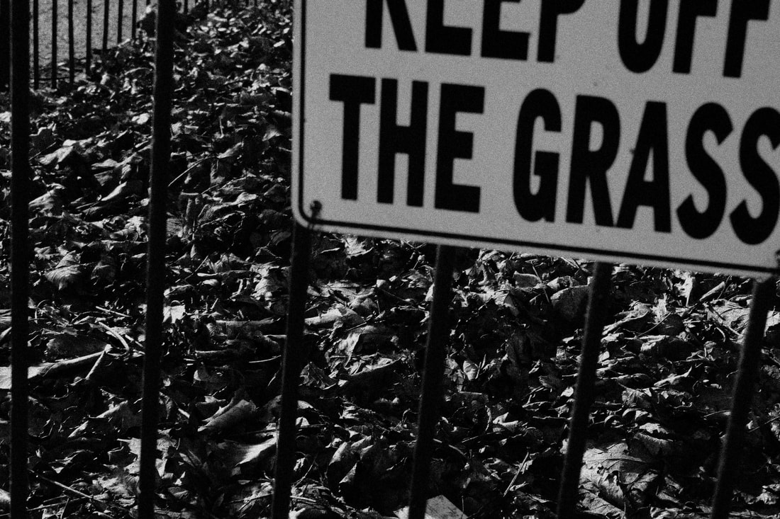
I would describe the images published in Provoke as grainy, gritty, and authentic. The blurred images of real subjects doing normal things, often unaware of their being photographed. For me this showed exactly what it intended to, the alternative to the general conventions of photography at the time, which really expresses the whole theme of the book in the right way.
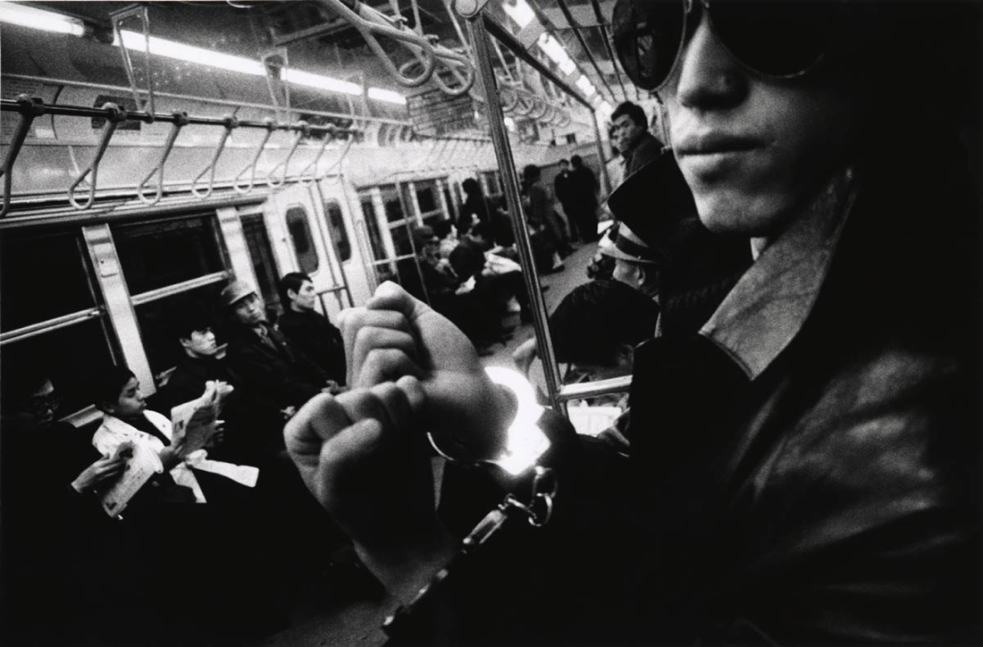
Daido Moriyama
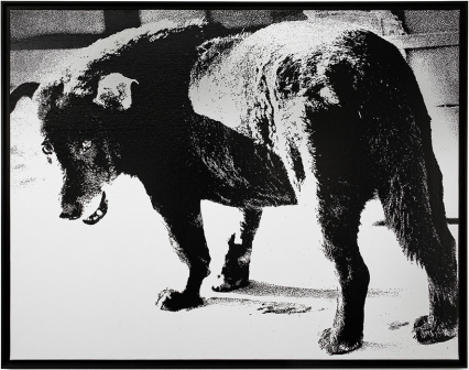
I looked at one of the more famous photographers who was involved in the Provoke series, Daido Moriyama. Moriyama is most famous for showing the darker side of urban life in the more unknown parts of cities. His photos have a distinctive black and white style that's grainy, 'rough' and blurry or 'out of focus'. The images he took of post-war Japan and after this have been exhibited in galleries all over the world due to the unique style of them, challenging the stereotypes of a 'good photograph'. I personally really like Daido Moriyamas style of photography and I enjoyed responding to his and the Provoke work.
I looked at one of the more famous photographers who was involved in the Provoke series, Daido Moriyama. Moriyama is most famous for showing the darker side of urban life in the more unknown parts of cities. His photos have a distinctive black and white style that's grainy, 'rough' and blurry or 'out of focus'. The images he took of post-war Japan and after this have been exhibited in galleries all over the world due to the unique style of them, challenging the stereotypes of a 'good photograph'. I personally really like Daido Moriyamas style of photography and I enjoyed responding to his and the Provoke work.
My Response
Selection/Narrative
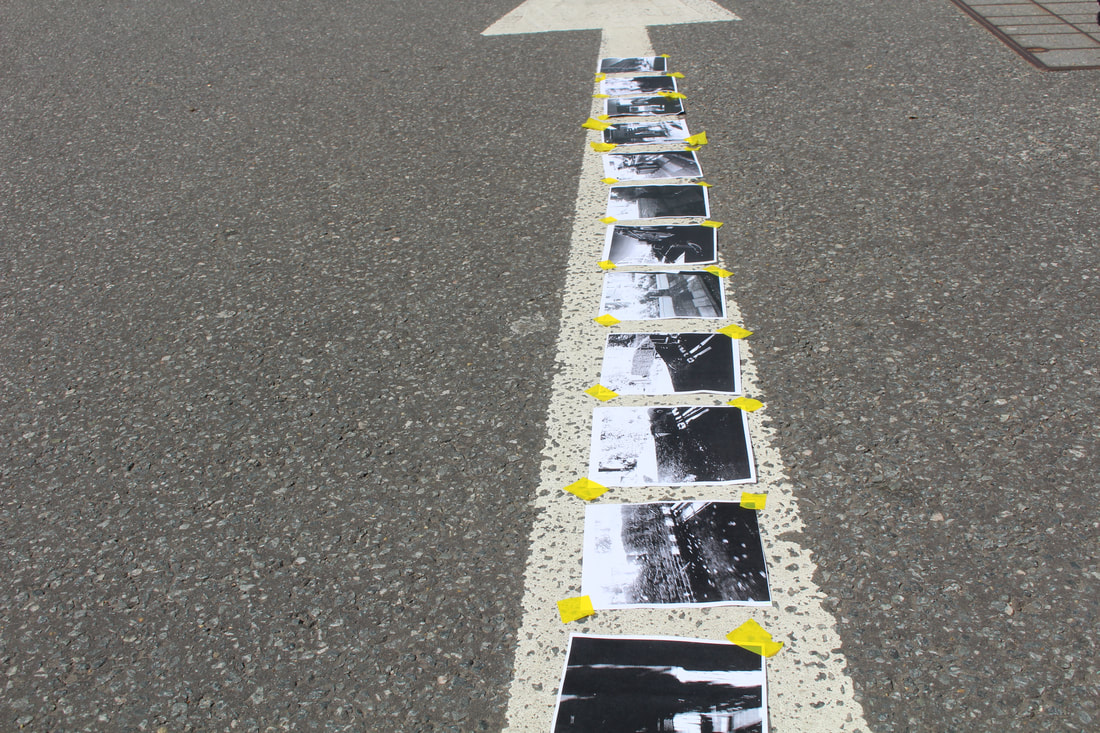
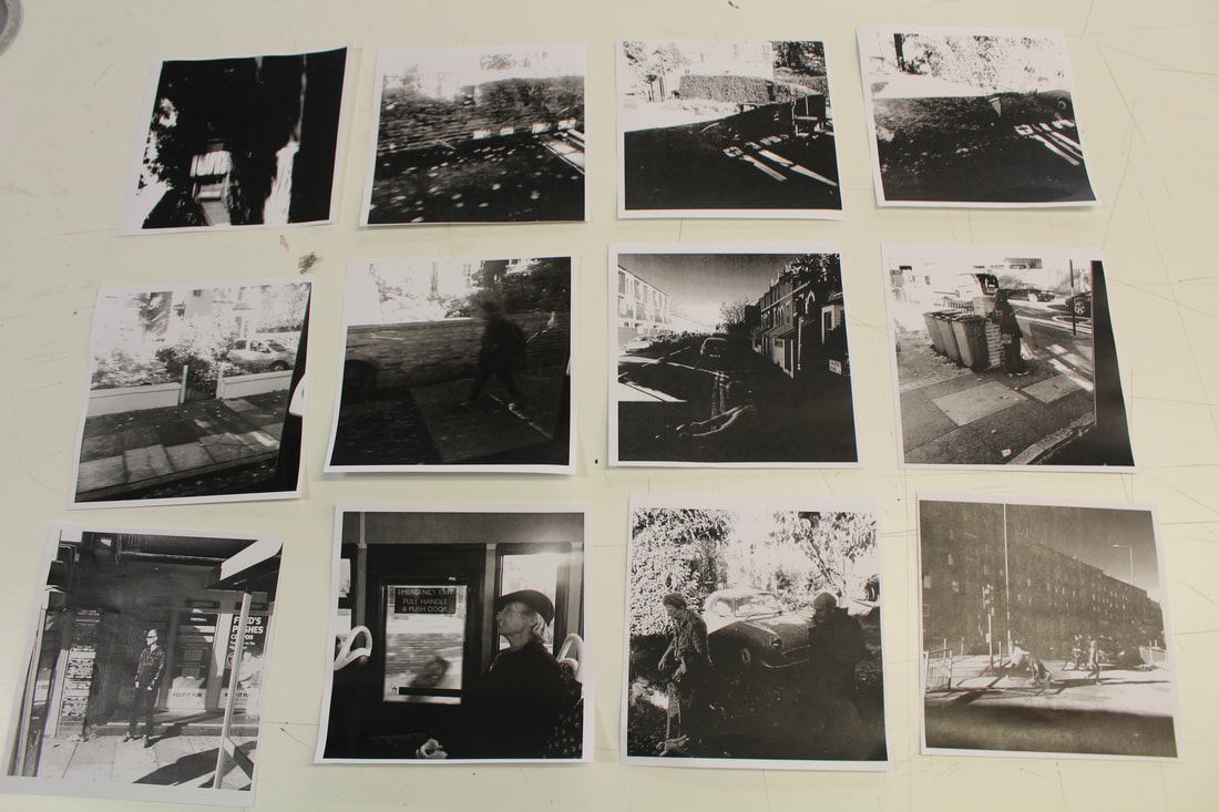
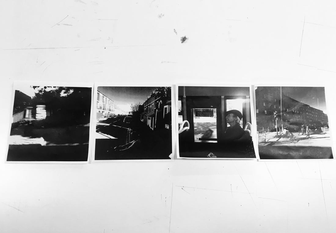
As a task to help us practice narrowing down a wide selection of photos for a specific purpose we had to choose 12 images from a selection provided by our teacher. This selection had to show some form of a narrative and relation between the images, perhaps a journey, something from start to finish. My group decided to arrange the photos with the theme of 'growth'. We did this with the growth of light shown and the growth of population and people within the images. starting with the blurriest and darkest images and ending with the lightest and busiest the photographs in-between show the journey of more people and more light. We then had to narrow down this selection to 4 images. We did it as a way a certain line of light passed through the 4 images in a row, almost as if its more than part of each photograph.
Mirrors and Windows
For our task we studied the idea behind the curation of the 'Mirrors and Windows' exhibition at the MoMA. The idea was that images are either a 'Mirror' of the photographer or a 'Window' for the photographer.
Inspiration - RAYSCORRUPTEDMIND
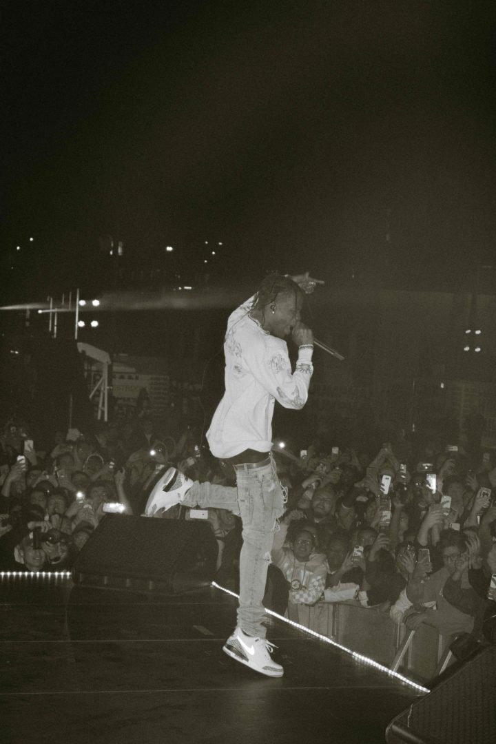
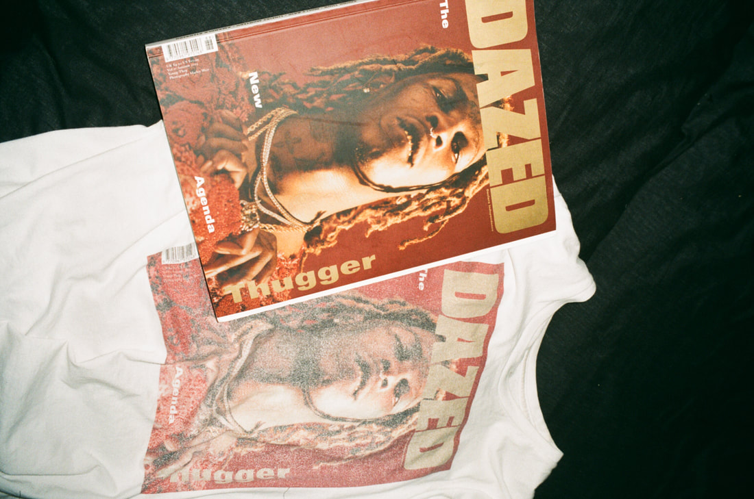
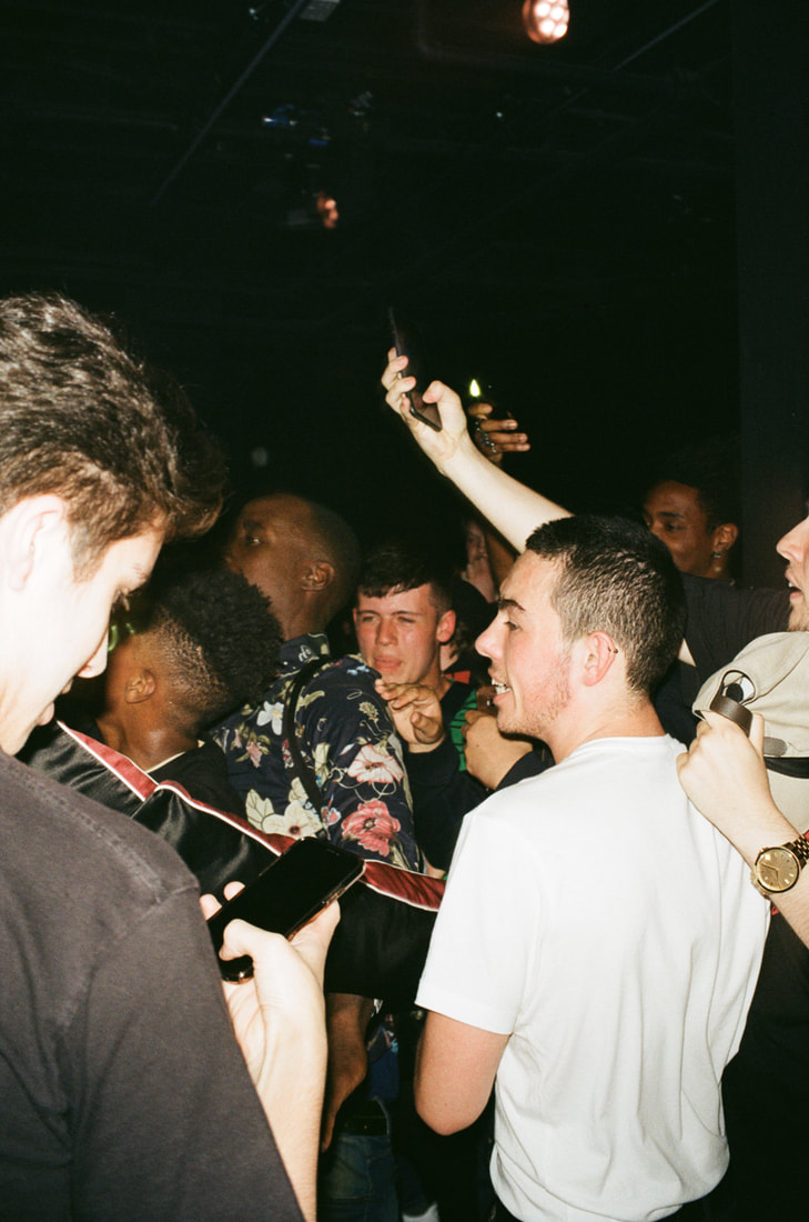
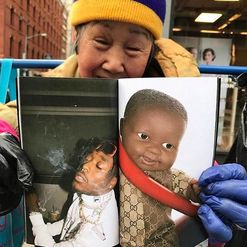
Rayscorruptedmind is the pioneer of being a 'typical' rapper photographer. This is what I like about him and his work. He doesn't use any stand out techniques and his style of photography (even though it is quite a new trend set by him and Gunner Stahl) isn't original at all. Yet his photos are appreciated worldwide purely for the subjects and content. I thought this was an interesting concept, photos only being lied and shared because of the content, not the artistic creativity. The content of his images are people and clothing that are well known throughout social media and the world, and this is the pure reason these images are os popular. The viral images he makes of stars such as Travis Scott, Kylie Jenner, Playboi Carti and Lil Yachty are shared and known purely because these people are in them and the images he makes of stylists such as Ian Connor and Bloody Osiris are known for the clothing worn, not the style of the image. I thought this was interesting as we spend lots of time studying the techniques of various different photographers, so choosing someone who's subjects are his only appeal from a photographical point of view is something new.
I personally am a fan of Corrupted Ray's work because I am interested in the artists and clothing featured in them.
I decided to base some of the content of my photobook on this type of content as I find it very interesting and would like to try it myself.
I personally am a fan of Corrupted Ray's work because I am interested in the artists and clothing featured in them.
I decided to base some of the content of my photobook on this type of content as I find it very interesting and would like to try it myself.
CONTENT/SEQUENCE/NARRATIVE
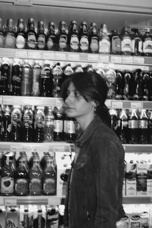
The content of my photobook is mainly based around things I am interested in on other people. I like clothing ad fashion so lots of my photographs involve this as the subject.
I chose this narrative because I thought it would be something a viewer would have to work out but when they do, they could relate to the idea behind it.
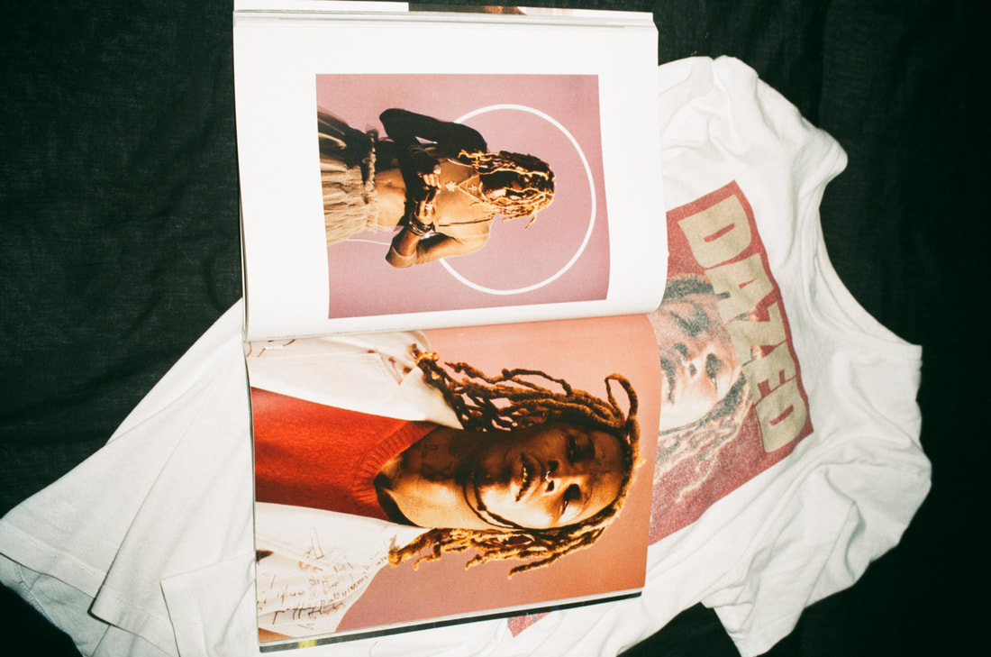
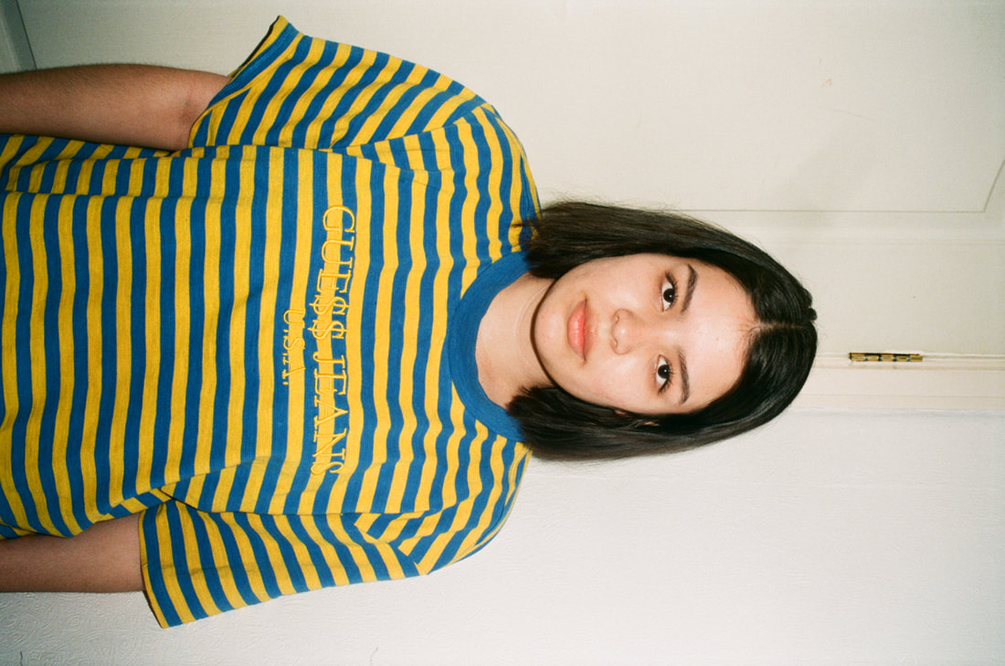
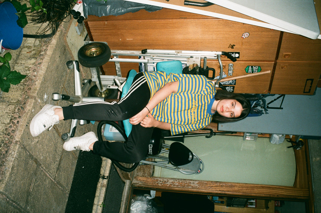
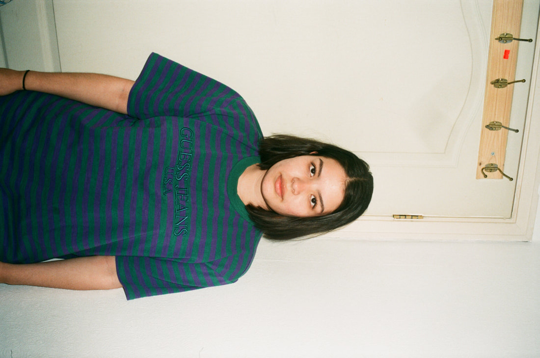
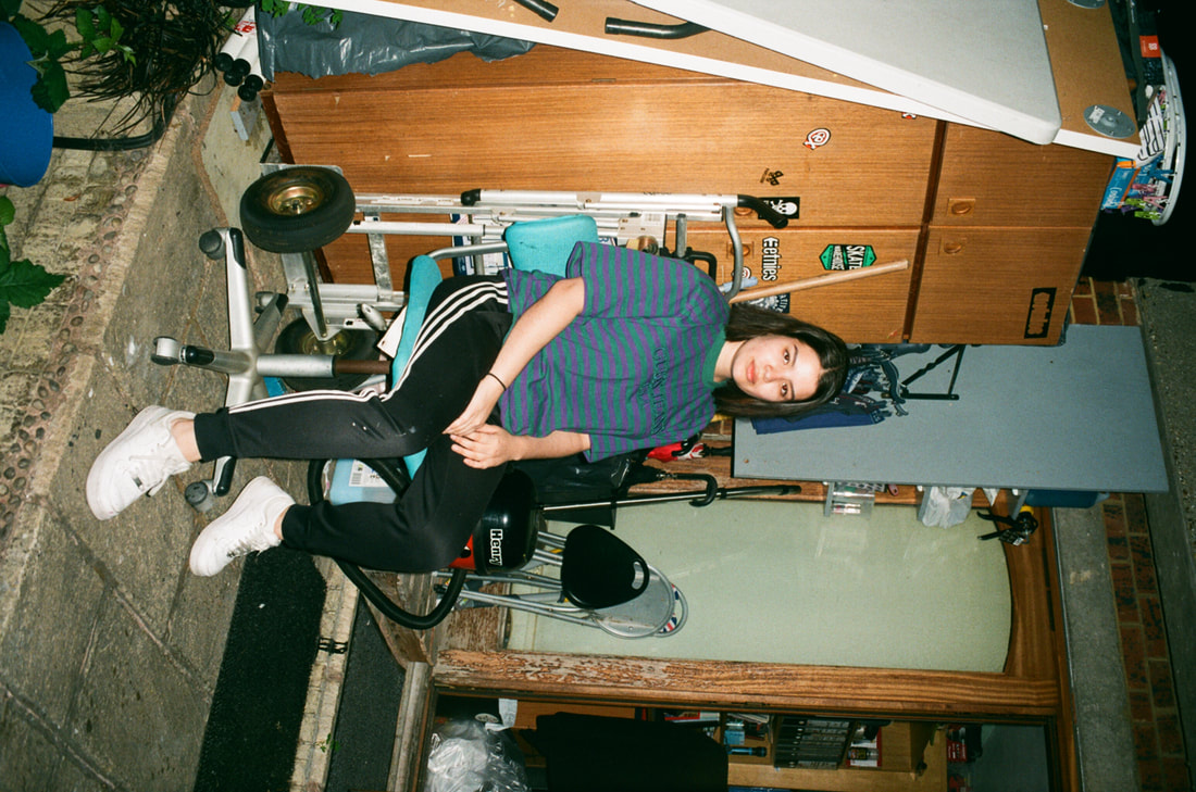
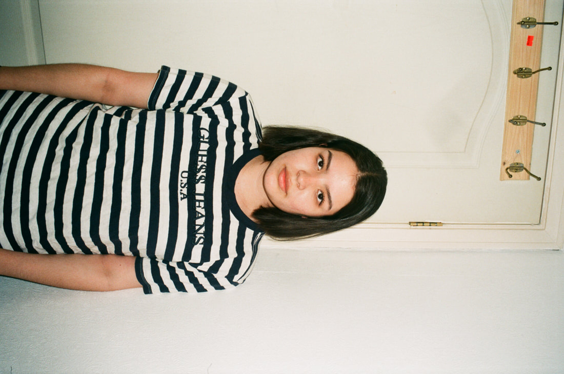
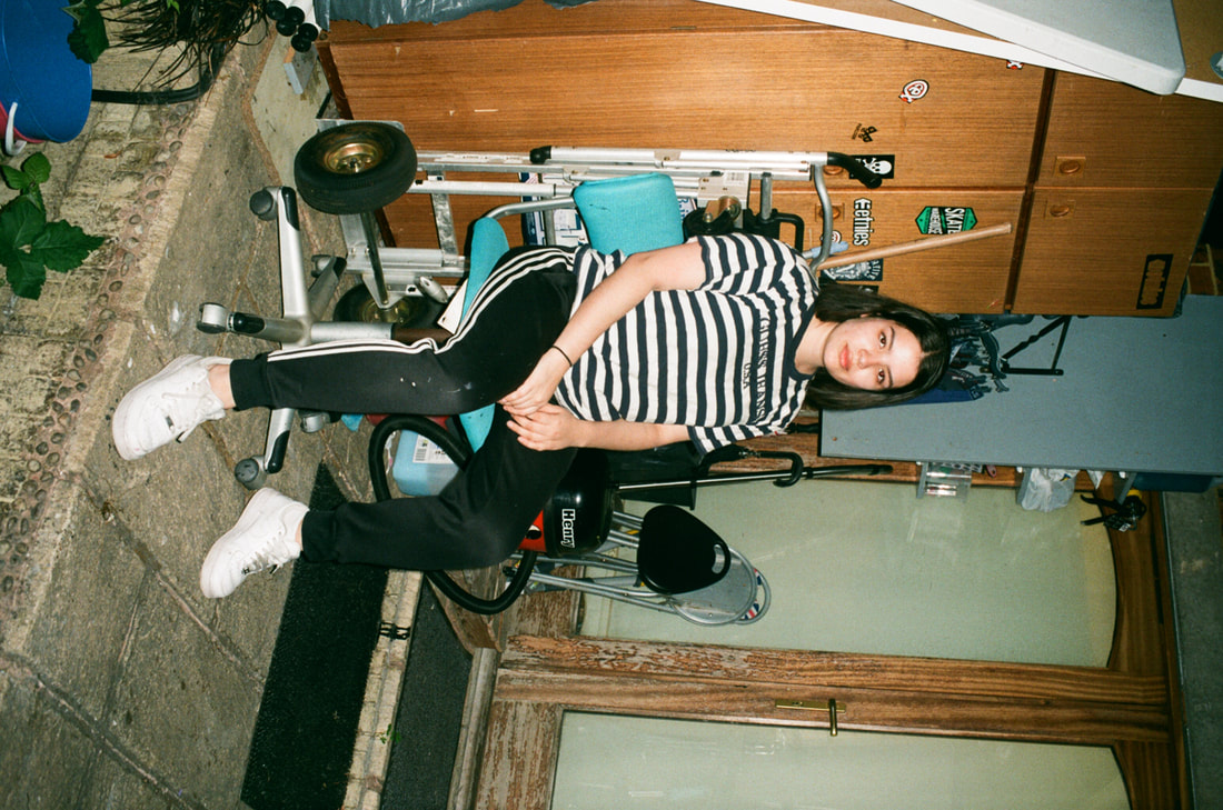
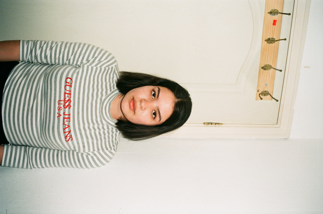
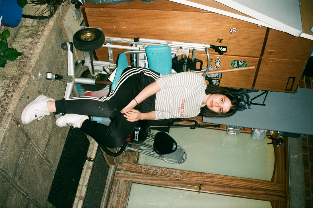
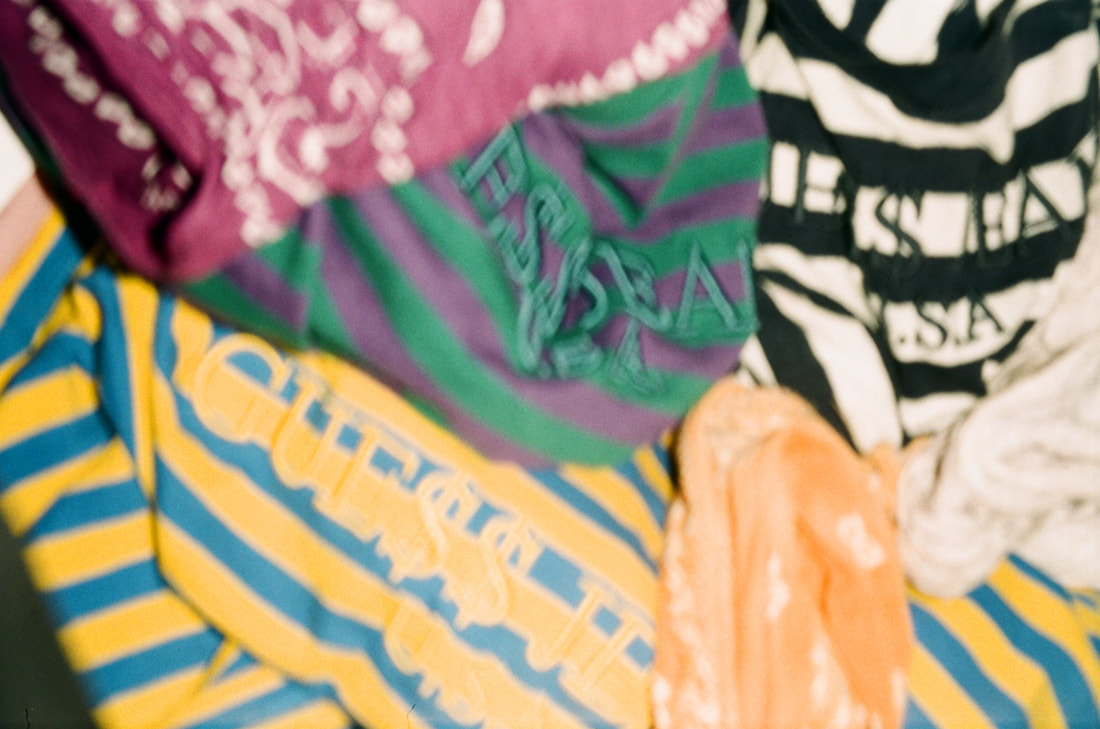
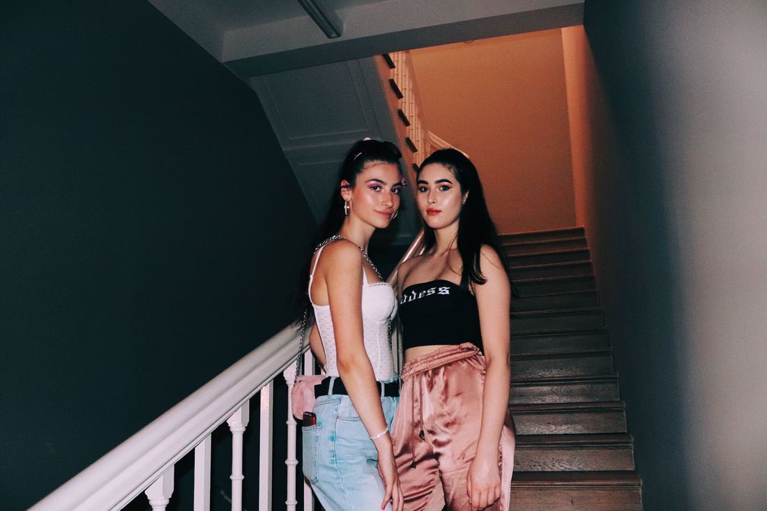
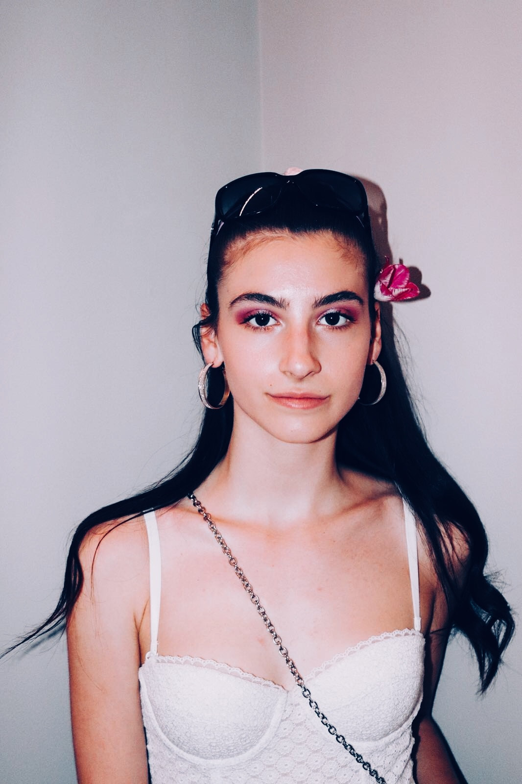
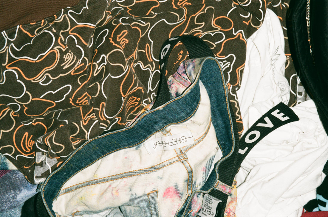
I decided to sequence my photographs with a simple, short narrative -- style and going out. I chose this because I like the whole process and build up behind it. It starts with a set of 2 images of a magazine and a matching top, representing decisions of what to wear and how its based on the things you see on social media and in magazines of 8 similar images of my friend in similar looking tops. This represents decisions before you go out to somewhere and the stress and quick changes of things like outfits. Then there's a close up of a pile of clothes to show how these decisions from before are discarded and just thrown around because of the rush.
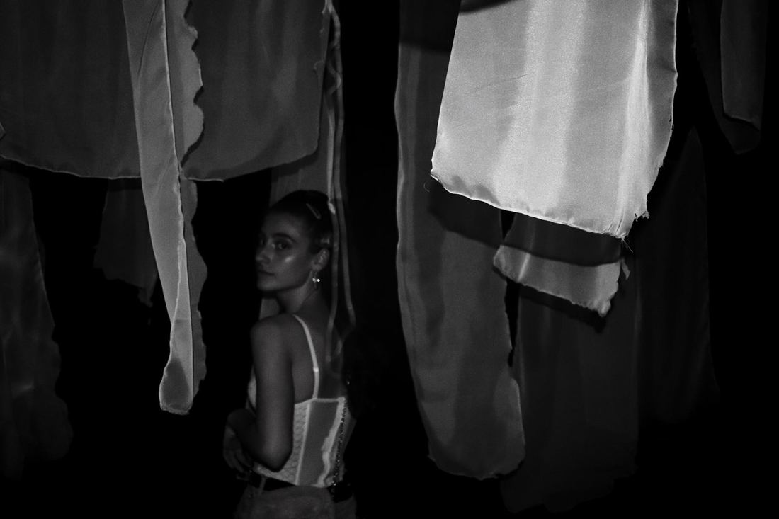
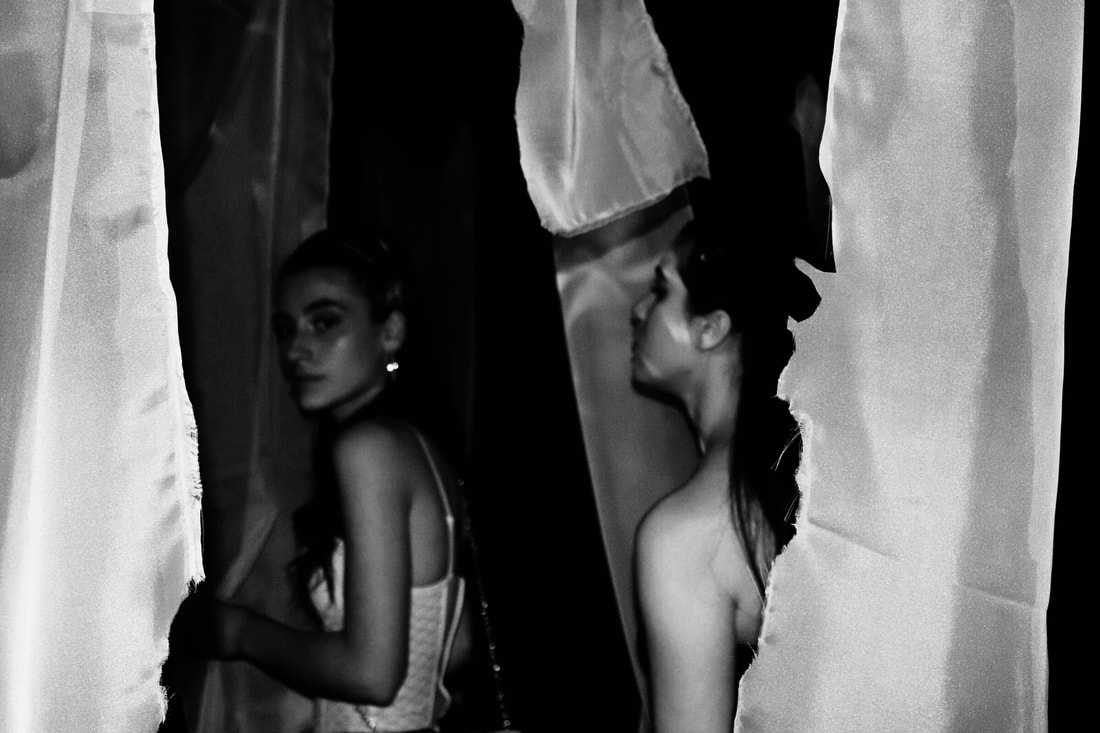
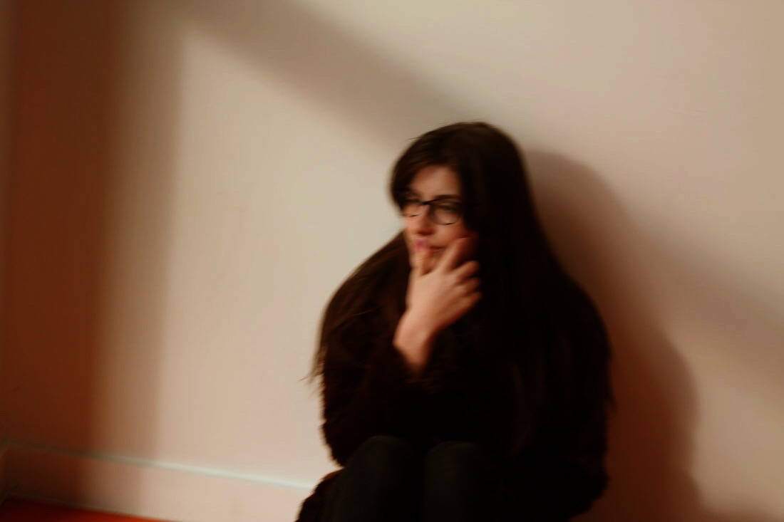
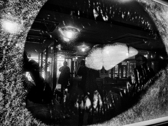
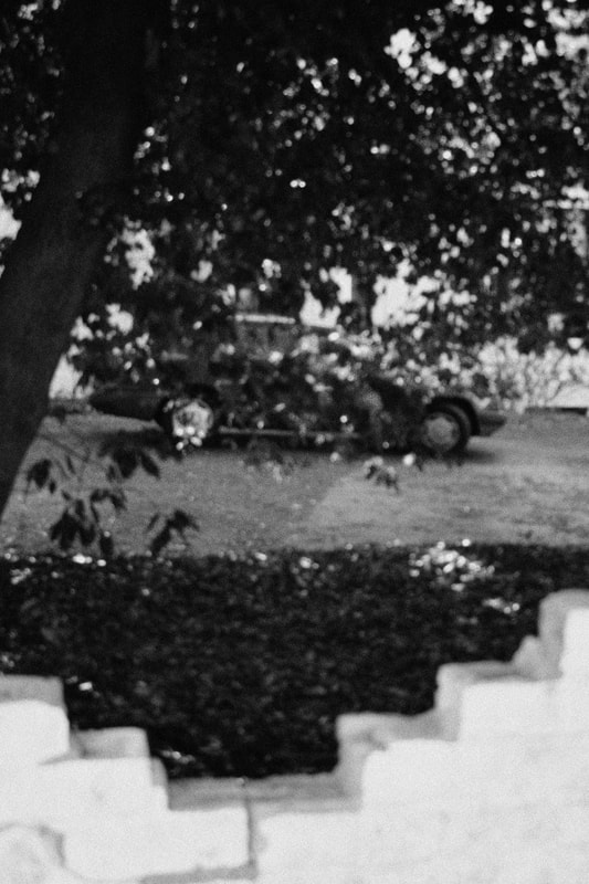
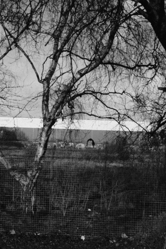
The second section is a series of images taken at the Marian Goodman gallery in London, it represents getting lost in the/at night, they're mainly dark images with a girl/ girls looking around. These are the only black and white images in my photobook because I wanted to make them look neutral because o the narrative. What I mean by this is what I want to represent could be good and bad for different people so I showed this contrast of good/bad with the black/white filter.
I chose this narrative because I thought it would be something a viewer would have to work out but when they do, they could relate to the idea behind it.
I decided to sequence my photographs with a simple, short narrative -- style and going out. I chose this because I like the whole process and build up behind it. It starts with a set of 2 images of a magazine and a matching top, representing decisions of what to wear and how its based on the things you see on social media and in magazines of 8 similar images of my friend in similar looking tops. This represents decisions before you go out to somewhere and the stress and quick changes of things like outfits. Then there's a close up of a pile of clothes to show how these decisions from before are discarded and just thrown around because of the rush.
The second section is a series of images taken at the Marian Goodman gallery in London, it represents getting lost in the/at night, they're mainly dark images with a girl/ girls looking around. These are the only black and white images in my photobook because I wanted to make them look neutral because o the narrative. What I mean by this is what I want to represent could be good and bad for different people so I showed this contrast of good/bad with the black/white filter.