SELECTIVE Colour
I chose to look at selective colour because I like the idea of mixing art and science. To create an image that is visually stunning using colour theory is something I am very excited to experiment with.
History of colour photography
|
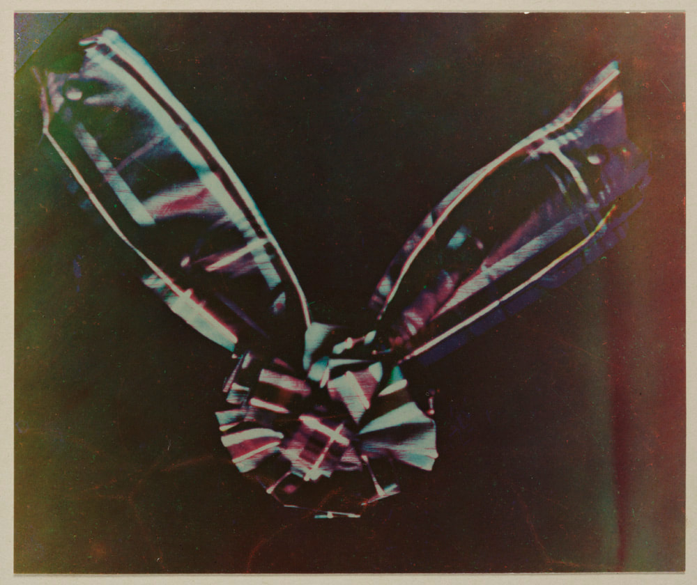
in 1861, a young Scottish physicist, James Clerk Maxwell, conducted an experiment to show that, in fact, all colours can be made by an appropriate mixture of red, green and blue light.
|
|
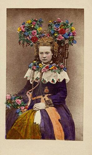
Before colour photography became available, photographers and artists gave their images colour by hand-colouring them. Several different processes and materials were used for hand-colouring, and it provided studio employment for many miniature painters who had initially felt threatened by the appearance of the new medium. Even after the emergence of the first practical colour processes, hand-colouring continued to be popular since it was often a cheaper and simpler alternative. Some of the results were very crude, but in the right, skilled hands, effects of great subtlety and beauty could be achieved.
Even at its very best, however, hand-colouring remained an arbitrary and, ultimately, unsatisfactory means of recording colour which could not reproduce the colours of nature exactly. What was required was a photographic process that could record colours directly in just the same way that it was already capable of capturing light and shade. |
|
The Autochrome was the first fully practical and commercially successful colour screen process. It was invented in the early 20th century by two French brothers, Auguste and Louis Lumière, who had been experimenting with colour photography since the 1890s.
Autochrome plates were simple to use. They required no extra equipment and photographers were able to use their existing cameras. However, exposure times were long, even in bright sunshine, an exposure of at least one second was needed and in cloudy weather this could be increased to 10 seconds or more. Even in a well-lit studio, portraits could require an exposure of as long as 30 seconds.
The first commercially successful colour film was Kodachrome. Kodachrome is a black and white film on which coloured dyes are added during the processing. Kodachrome processing involved repeated development, dyeing and then selective bleaching and was extremely complex. In all it required at least 28 different stages that could only be carried out in labs, so photographers were unable to process their own film but had to send it back to the labs.
AnniE Leibovitz
Annie Leibovitz is an American portrait photographer, best known for her engaging portraits that are often of celebrities. She was born on October 2, 1949, in Waterbury, Connecticut. While she was studying painting at the San Francisco Art Institute, she also took night classes in photography, and in 1970 she began doing work for Rolling Stone magazine. She eventually became Rolling Stone’s chief photographer in 1973. She left the magazine 10 years later, and over the course of that decade she had shot 142 covers. In 1983, she joined Vanity Fair, and in 1998 she also began working regularly for Vogue. Leibovitz has created several award-winning advertising campaigns. She has also collaborated with many arts organizations, including American Ballet Theatre, the Brooklyn Academy of Music, and the Mark Morris Dance Group, and with Mikhail Baryshnikov. Her books include Annie Leibovitz: Photographs (1983), Photographs: Annie Leibovitz 1970–1990 (1991), Olympic Portraits (1996), Women (1999), American Music (2003), A Photographer’s Life: 1990–2005 (2006), Annie Leibovitz at Work (2008), Pilgrimage (2011)
Exhibitions of her photographs have appeared at museums and galleries all over the world, including the National Portrait Gallery and the Smithsonian American Art Museum in Washington, D.C.
Aiming at capturing her subject’s personality and inner life, her images reflect intimate or staged moments that reveal the playful and expressive aspects of her sitters, this is showcased in her 'Disney Dream Portraits' series.


Leibovitz's style is opposite to that of photographers like Terry Richardson. She captures her subjects in soft lighting as opposed to the hard snapshot flash. Her models are posing like they are sitting for a painting, rather than being free. She places her models in impossible settings.
What’s most distinctive is the 'painter' quality to her work. The mood, poses, lighting, background, and post-processing all contribute to a kind of 'Rembrandt look'. Leibovitz's images also tell a story. Her group shots and portraits balance the well-lit models with ambient lighting, not losing out on one for the other. Her images look as if they are stills within a bigger movie.
What I think is important in her work is the painted canvas backgrounds she uses. Leibovitz uses her backgrounds to create this stunning worlds, they are a key part of making these images as good as they are. The use of a background to make the colour look better intrigued me most from studying Leibovitz's work and I decided I wanted to pursue something like this in my own work.


Sin City
Sin City is a neo-noir film directed by Robert Rodriguez and Frank Miller that uses black and white extensively to exaggerate emotions and characters by throwing in spots of distinct colour to show something important. Most of the symbolism in this film is shown by using colour in mostly dark or greyed settings. The viewers see details that the director wanted them to notice due to them being highlighted in red, green, or bright yellow colours. This looks amazing and it makes the film seem that much more dramatic and visually similar to the source material, like watching the comic book come to life.
Violence and sex are the two most common occurrences in the film, and these are both amplified with the use of distinct colors to help overwhelm the viewer’s senses.
The colours that are used in this film contribute to the exaggerated 'sexiness' and movements shown. All the colours appear in a very specific way, making a statement that helps make an essential part of the film deeper.
The use of colour differs between the villains and the heroes of the film. For example, villains may be shown in a smaller setting with lighter shades of black, and the heroes are shown with sharper blacks and the use of colours more frequently. Also, many times in the film, a villain’s blood comes out as white, maybe helping to signify the evil of the character and the inhumanness of their actions or motifs. The heroes on the other hand bleed dark red and often have a close up to their face and showing the distinct blue or green colour of the eyes of that hero. The use of colour enhances the thrill of the film and helps signify the importance of a certain event or character. This use of colour helps the viewer separate good from evil and the positive or negative emotions that go on in the film.


Wes Anderson
Filmmaker Wes Anderson has created and developed a distinct style that is easily recognisable through his use of colour palettes. Anderson’s personal experiences with those of his characters show the importance of colour in his films as it connects to the social structure.


The most famous and (in my opinion) best use of colour in Anderson’s films is in The Grand Budapest Hotel. His production design is bright and extravagant. Anderson works closely with designer Adam Stockhausen and comes into a production with a specific colour palette in mind and they decide what colours work well.
The Grand Budapest Hotel evokes certain colours: Pink, purple and red. Anderson plays on contrast and similarity within these tones.
Colour can establish a mood that keeps with the action or environment a director wishes is portraying onscreen. It creates a fairy tale-like feel to Anderson’s films because the bright colour palettes contrast with the bad/sad situations.
'The funny thing is, we started with all this pink, and I think this would be true of any colour—if you use too much of it, you stop seeing it because it’s everywhere and you start taking it for granted. So, we found that we had to add in yellows and different colours to kind of cut it back so you could see it more' (Grobar, 2015)


Tarsem Singh's 'The Fall'


“The Fall” is a film directed by Tarsem Singh about a patient telling a vivid story about five heroes to a young girl.
The film was shot in multiple countries over the course of four years, it took this long because Singh wanted to bring out 'the most in vivid hues'. It is another example of how colour can alter the perception and create an emotional response or cue within the movie, much like Sin City and The Grand Budapest Hotel.
By making colours bleed into each other, Tarsem creates transitions that appear to follow after each other, even though the objects are completely different, such as the priest’s face merging onto pattern on the sand.
Colour can be used to signify interest and how the girl in the story perceives the world. The hospital in which the patients are staying in are bland and dull and mainly consists of yellow and green hues, whilst the story world has utilised a palette of many different colours which are all helping to create a vivid world for the girls imagination. It creates a contrast between the fictional story and the reality.
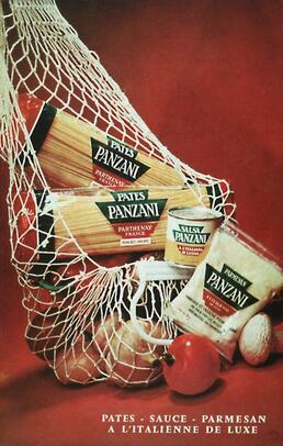
PANZANI advert
|
As part of my research, I read the essay 'Rhetoric of the image' by Roland Barthes. The essay is a deconstruction of the marketing techniques used in a pasta advert, and in one part of it, Bathes talks about the use of colour. He explains the 'Coded Messages' in the advertisement show the colours of the Italian flag. The white bag and cheese, the green packaging and vegetable stalks and the red background and vegetables all represent the red, white and green of the Italian flag. This caught my interest because the brand that is advertising here, Panzani, is a French company. Pasta is a famous Italian dish, so the relation to Italy in this advertisement creates a sense of authenticity with the product, it be true Italian pasta.
|
|
MACIEK JASIK
Maciek Jasik is a photographer based in New York City whose work 'seeks to understand society’s relationship with the natural world'.
Through his photography, Maciek Jasik 'tests the limits of color and movement' and also tries to work in the area between planning and spontaneity. His photography explores ideas of identity, gender and 'the self' while working in a parallel world of endless colour.
Maciek aims 'to reach a balance between aesthetic and emotional concerns with a powerful, yet subtle and unique use of colour'.
I looked at the work of Maciek Jasik because I stumbled across his work in an article I was reading about photographers who frequently use colour in their work, and Jasik's images immediately caught my eye. I went on to his website and began looking at the 'Portraits' section, as I was intrigued as to how Jasik would work with his subjects. I think the use of light in Jasik's photography plays a big part in making the images as stunning as they are. The colour seems subtle and translucent and not too intense. Using light and gels to create images like this is something that I would like to incorporate into my final project for selective colour.


I then looked at his photography series 'Bypassing the Rational', which is a set of 88 images of peoples bodies, saturated in many colours. It's a more intense use of colour than his portrait section, but I do not think the images in this series are more intense. The colours are light and bright, they have a gentle feeling to them and the contrasting of warm and cool colours creates this. I would not like to pursue a use of colour this intense.


Slava semeniuta
I decided to look into an artists who makes images with more intense use of colour. I wanted to gauge how the use of neon lights could be incorporated into photography. The artist I chose to look at was Slava Semeniuta. His work struck me because of the way he uses deep, vibrant neon colours to bring his images to life. I loved the alternative look to them, they reminded me of the use of colour in films like 'Only God Forgives', where the colour palette is vibrant and harsh to match the theme of the film. The use of colour in Semenuita's photographs had clear decisions behind it, picking one colour to contrast another and another colour to complement another, this use of colour provided some inspiration to my final project.


ADRIEN BROOM'S 'THE COLOUR PROJECT'
I then looked at a photo series by Brooklyn-based photographer Adrien Broom called 'The Colour Project'. She spent two years creating a colour-infused world around a little girl. The series starts with the girl in her plain all-white bedroom and from there she moves into 'dreamy monochromatic worlds', finally ending up in the same bedroom, this time exploding with colour. With the project taking two years to complete, we also see the girl grow up in each frame.
The detail that goes into each of Broom’s sets are impressive, proving her to be a competent set designer as well as photographer. This reminded me of 'The Fall', but in a much more simplistic form.
The detail that goes into each of Broom’s sets are impressive, proving her to be a competent set designer as well as photographer. This reminded me of 'The Fall', but in a much more simplistic form.


Experimenting with changing colour in photoshop
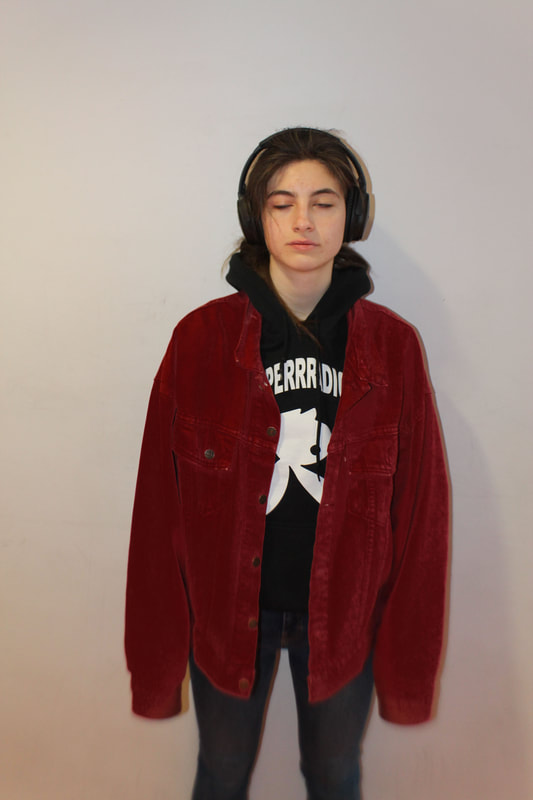
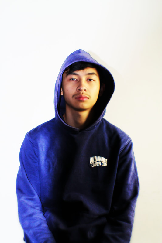
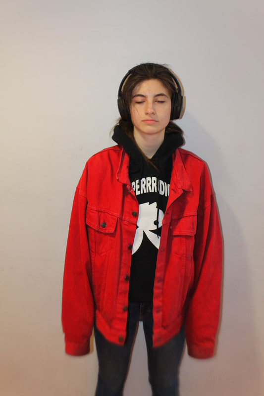
I took some simple images of my classmates so I could experiment with changing the colour in the image in photoshop. I did this so I could broaden my photo editing skills and use these skills in my final project to really make my colour exactly what I wanted it to be. what interested me with editing these images was that there was virtually no difference on the subjects skin tone when I changed the colours of their clothes.
|
|
COLOUR THEORY
Colour theory has a range of different concepts. But, there are three basic categories of colour theory that were most useful to me: The colour wheel, colour harmony, and the context of how colours are used. These colour theories create a structure for colour, and I thought it best to study them before I created images.
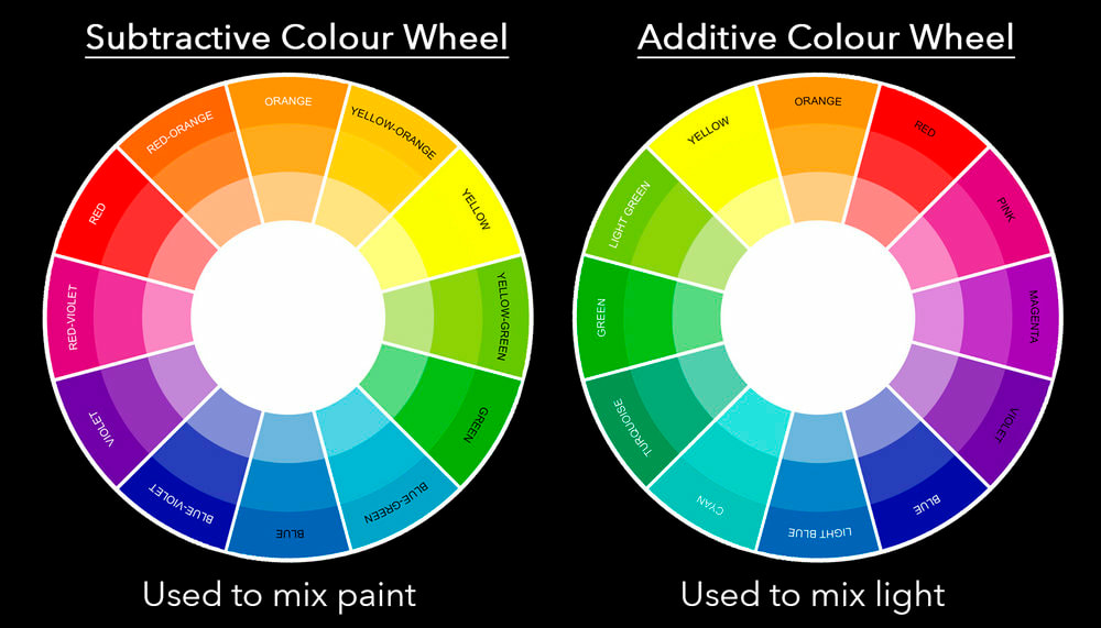
The Colour Wheel is a colour circle, based on red, yellow and blue, and is used a lot in art. I looked into what the Primary, Secondary and Tertiary colours used in these wheels meant, as I'd be using the wheels as a basis for my work.
Primary Colours: Red, yellow and blue
In basic colour theory (used in paint and pigments), primary colours are the 3 colours that cannot be mixed or created by any combination of other colours. All other colors are created from these 3.
Secondary Colours: Green, orange and purple
These are the colours formed by mixing the primary colours.
Tertiary Colours: Yellow-orange, red-orange, red-purple, blue-purple, blue-green & yellow-green
These are the colors formed by mixing a primary and a secondary colour.
Analogous colours are any three colours which are side by side on a 12-part colour wheel, such as yellow-green, yellow, and yellow-orange.
Complementary colours are any two colours which are directly opposite each other, such as red-green and red-purple and yellow-green.
Nature provides a perfect departure point for colour harmony. In the illustration above, red yellow and green create a harmonious design, regardless of whether this combination fits into a technical formula for color harmony.
I then looked at 'Colour Context'. Colour context was how colour looks in relation to other colours and shapes. The contrast effects of different colour backgrounds for a singular colour ( i.e. multiple colours serving as a background to something red). For example, Red appears more vibrant against a black background and less vibrant against a white background. With an orange background, red appears much less vibrant. Colour Context is looking at the effects colours have on each other, something which I find interesting and wish to explore in my work. The relationship between saturations and the warmth or coolness of contrasting colours can cause differences in our perception of colour
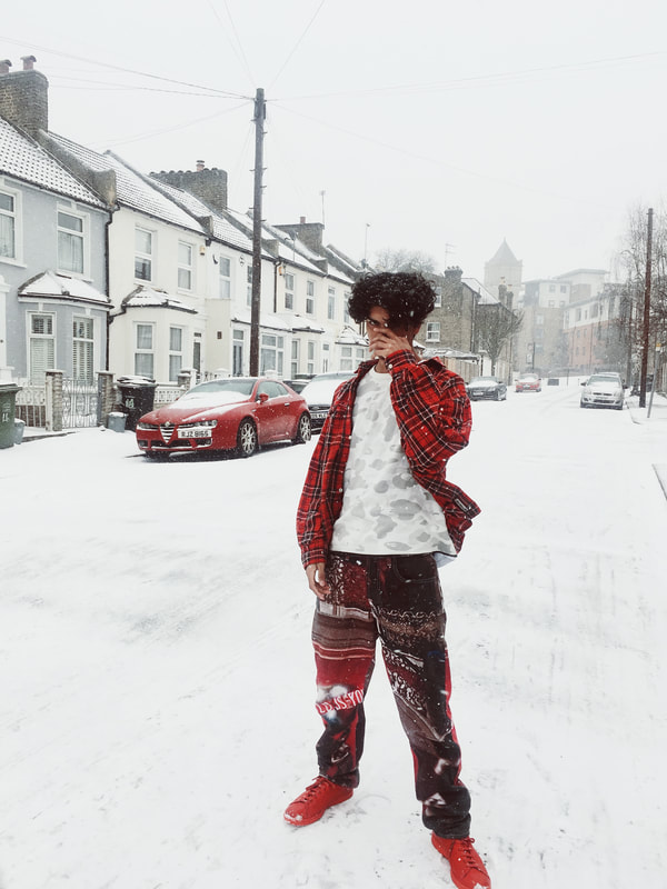
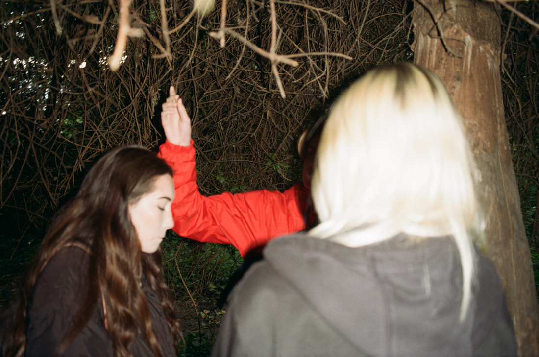
As I almost always do when exploring a new style/theory in photography, I look back at my own work to see if there are any elements of the topic reflected in my past projects. I do this because if there is, I can think back to the processes and steps I took to create that image and use them in my current work. One photo of myself that I had not taken, but directed struck me to have major elements of selective colour. I took this photo in early 2018, when snow hit the UK and I wanted to get some good shots of myself. Often with images of me, I direct whoever is taking the photographs very precisely as I always have a perfect idea of what I want myself to look like in my head, so its all about forcing my vision into the photographers eye. I directed my younger sister to take a photo of me out in the snow, next to a red car and after many failed attempts, this photo came out. I looked at it and thought that it was the perfect example of 'Selective Colour'. The bright red stands out so much against the neutral background and. directly correlates to the bright red car next to it.
MY RESPONSES:
It may be a topic of controversy in photography, but I consider photos that I have directed to be my own. Even though it was not my eye looking through the lens and not my finger that pressed the shutter, it was my mind that made the image what it is. I decided that I would be the model in these photographs because I wanted to experiment with directing, like Annie Leibovitz and Wes Anderson.
As a staring point, I began working with contrasting colours. I thought that, even though most colour palettes don't show red and blue as contrasting colours, society does. I decided what I wanted to do was represent contrasts in popular culture through colour. I started out with the most known contrasts in urban society, 'Bloods' and 'Crips'. I have always been interested in rap music and American culture, and the Blood/Crip gang's use of contrasting colours to represent one another and to signify their different views has always been something I am interested in. It's a form of iconography in an area like Compton in South-Central Los Angeles, where these gangs originated and reside. If somebody is dressed in red, they will be identified as a member of the Bloods and it's vice versa with blue, they will be identified as a Crip. I thought about this being a use of selective colour in society and that exploring it would help me create my own world through colour.
I decided I would model in clothing that contrasted both red and blue. I decided to do this because clothing is what these gangs use to be identified, and mixing the two colours on to one item would show the contrast. I directed my friend to take these photographs of me against a neutral background. I chose a staircase at their house due to the brown wooden staircase and white walls, these colours would make the reds and blues of my clothing stand out more. I decided I would shoot on film to create a old, Chi Modu style to my images, relating to the old west coast gang feeling.


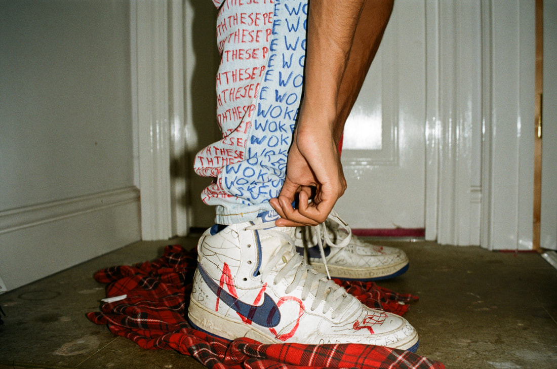
I think these images were unsuccessful. I do like them, but I didn't feel as if they showed anything that I wanted them to. They didn't show a clear contrast between the colours and I seemed to be more of the subject than the clothing, which is not what I wanted. The image below is what I believe to be my most successful image. I think that taking my face away from the picture and having the clothing more close up presented my idea in a better way. The old blue Nike shoes standing on the red flannel and the half red/half blue jeans showed everything that I wanted them to. This felt like injected colours in an urban society, the reds and blues right next to each other.
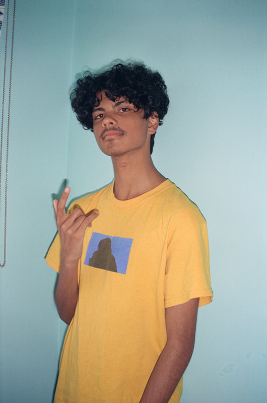
I then looked in to experimenting with 'Colour Context'. I decided to pitch light yellow against light blue. I decided to do this because the yellow t-shirt I am wearing in the photograph has a dark blue graphic in the middle. This graphic compliments the background as it is a darker shade of it. I modelled this and had my friend take the images under my direction. I felt as if this image was most successful. The lighter blues around me help compliment the yellows of my skin and the t-shirt, and helps the viewer center in on the graphic in the middle of the shirt. Colour Context is an interesting theory and I decided I wanted to adapt it into my final works.
|
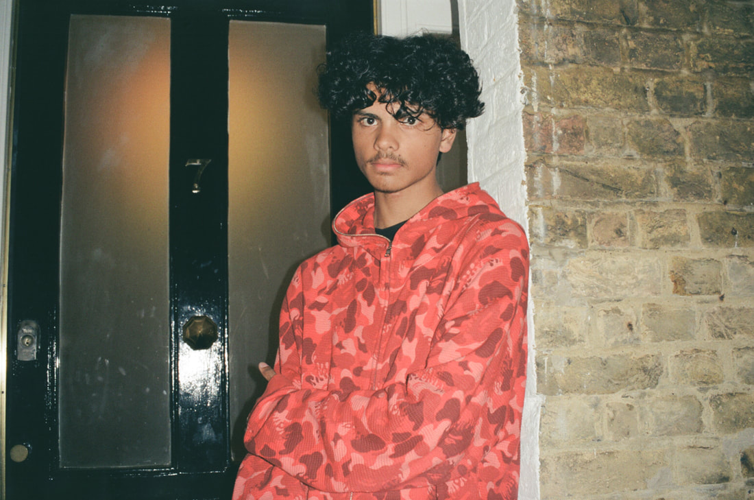
I decided to look more into the Colour Context theory. I modelled the image on the right and directed my friend to take the image showing me in my bright red hoodie at the centre. I put my light on behind the doorway to create a orange glow to compliment the red, and I thought the brown brick wall on the other side would help the viewer centre in on the red more. I do not think that this turned out be successful, as the black door is not a neutral colour and therefore demands attention in the image. However I do think the orange glow of the light compliments the red of the hoodie I am wearing and I successfully created this.
|
Plan for my project
After taking these images and experimenting with editing colour in photoshop. I felt as if I was ready to create my final set of images. I now knew how to select colour and present it against a background that I had chosen to create certain emotional responses.
For the final part of my work with colour, I would like to artificially create the colours that I intend to use, experimenting with colour theory. I am most inspired by the work of Maciek Jasik, and I would like to produce something in a style similar to his work. The manipulation of colour interests me a lot and using lighting and gels to gain more control of colours is something I would like to develop.
The use of bright lights to create a neon effect in my images is something that I would like to use in my final project. I want to convey the loneliness in the nightlife through the use of colour, following the idea of indirectly shooting neon lights by Slava Semeniuta and the harsh colours used by Maciek Jasik in his portraiture.
